A new redesigned web UI interface has been released for Google Play Store in order to be more similar with the Android applications’ design. For this first web version, the Google has more things to improve for the future, and here there are included the fonts, the general look and the solving of some bugs.
The Google Play Website is now fluid, that means no matter how wide is your monitor, the site will use the entire of it. This is a good point for the new designed Play Store website, because most other websites leave a lot of unusable blank space on the sides, like our site.
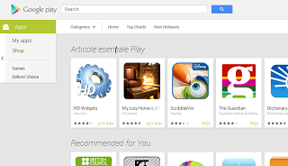
For the moment, Google Play Webpage comes with two sidebars on the left and on the top menu. The left menu is simple and it has only few buttons, and on the top menu we can find only the most important buttons, and on the very high top of the web page we can also find the search button.
After you click on a desired application, the top menu disappears and in front of you will be the application details and photos, but also you’ll be able to search other applications using the search box from very high top-left.
The Roboto font used allows users to easy read, especially in smaller sizes. Another new thing is that the Google Play Store web’s developers changed the colors and there’s a grey background.
It is clear for me that Google want to make more changes in their products and the simplicity is the first strong point. I am sure this change for their Google Play Store web page will be perfectly integrated with other new features.
In this moment, we can only wait to see what surprises Google team will bring us in the future.


