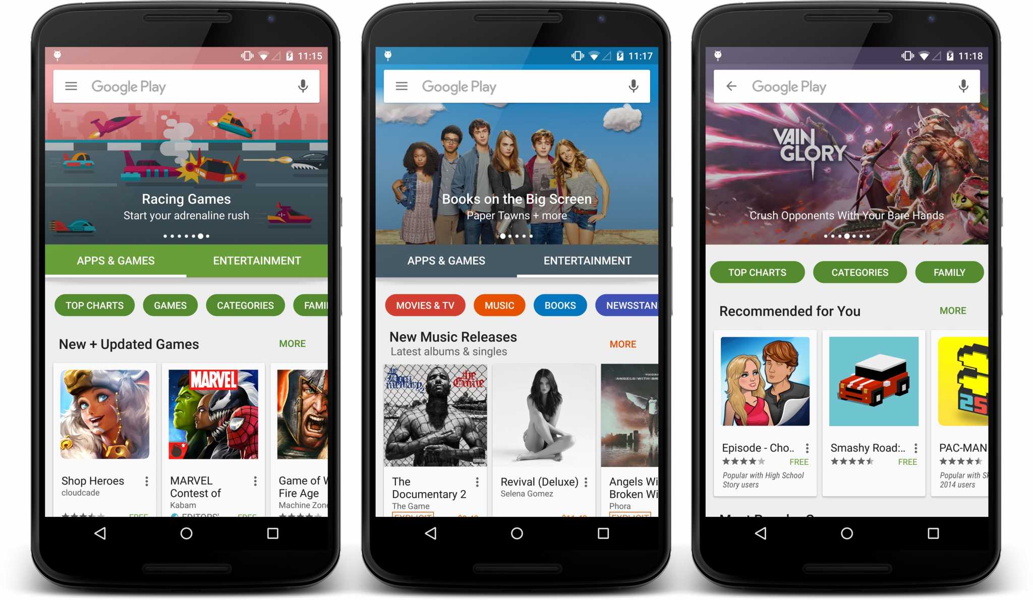
Android enthusiasts are well aware how Google is keen on experimenting with new app features as well as UI.They had recently published a video featuring the Pixel, which displayed an unfamiliar Play Store UI on the device. The latest UI changes will be more user friendly and will eliminate many shortcomings of earlier UI. The brand new user interface was presented with a new color scheme, a larger ‘Install’ button, and more. Elements from that video have begun popping up on devices of select enthusiasts.
As some screenshots submitted by readers reveal, some design tweaks are quite pretty. The size of ‘Install’ button has increased substantially, and the ratings and download figures are easier to go through. ‘Productivity’ category has been made more discernible. Of course, these changes have been welcomed by users.
You may notice the dark shade of green in the video. For time being, it is under testing and you will be informed soon about it. This screenshot, taken from the Google video, does not contain carousel.
A screenshot demonstrate a smaller carousel that Google has been working for some time. Another one discloses the new app install page after the installation process is complete. Then, yet another screenshot drops information about a relocated ‘More Information’ page. You will also find a reworded developer info area in the screenshot.
Previously, ‘More Information’ could be found below the app description. However, it is now visible above the developer info.
Here is the summary of UI changes in the Google Play Store:
- Install button is bigger than earlier, so it’s more distinct.
- App ratings are more distinguishable
- App category will be located beneath app’s description.
- Darker green UI.
- Productivity category can be easily found out.
The “Install” button is now bigger than before, while the number of downloads, as well as the app ratings are a lot more distinguishable. The category to which an app belongs to is now located beneath the app’s description and is centered. As for the overall look of the Google Play Store, the user interface now comes in a darker shade of green.


